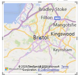
Maps in Power BI can be confusing. The fist map visual in the list looks pretty good:

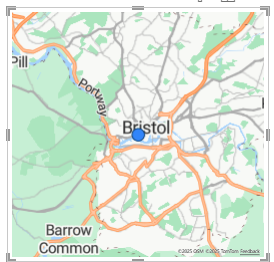
But if you use this Power BI will pester you to upgrade to Azure maps. Azure maps looks like this:

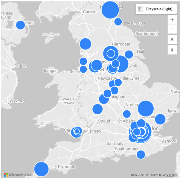
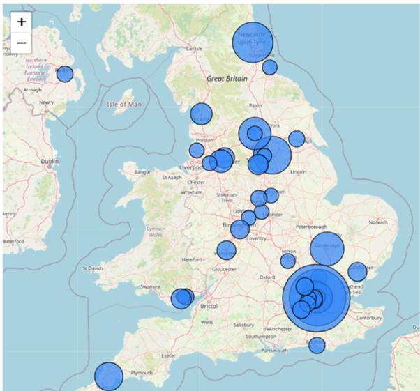
There are differences between the available bubble sizes in these visuals but that’s about it. There are some nice formatting options. Here’s a map with bubble sizes indicating learner achievement at awarding organisations across the UK:
There have been problems in the past with Microsoft limiting visibility of Azure maps to those logged in with the correct licence. This is no good when displaying a map for sharing more widely.
To stave off the problem I have found icon map to be the best open source, free, alternative.
Under visualisations click the three dots to get more visuals and search for “icon map”.
It looks like this:

This has all the features of Azure maps, just as many formatting options and will display fine even in publicly published Power BI reports.
Leave a Reply